Case study
Emibio by Mühlberger
We redesigned and expanded the brand identity and visual communication of Emibio by Mühlberger through a concept that explores the natural and the modern, the vintage and the chic.


Category - Branding - Packaging - eCommerce
Client - Dr. Mühlberger
Year - 2019
Country - Argentina
What we did
-
1
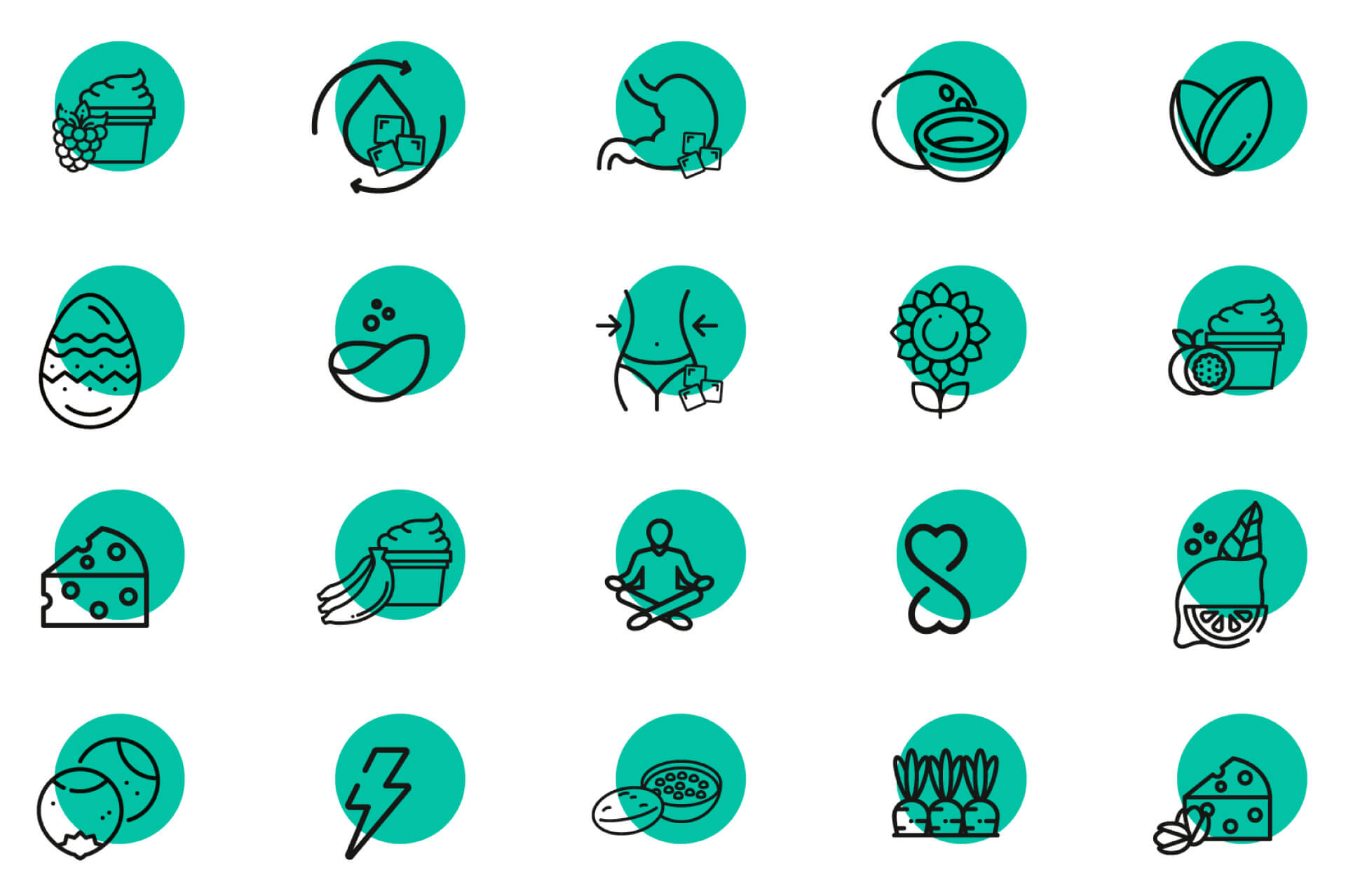
Iconography
Given the intrinsic need to have many own-brand products, it was crucial to develop an iconography system that would facilitate communication of the unique selling points of the brand.
-
2
Packaging
We designed the packaging of their own-brand products, take-away packaging, as well as their orthomolecular meal packages.
-
3
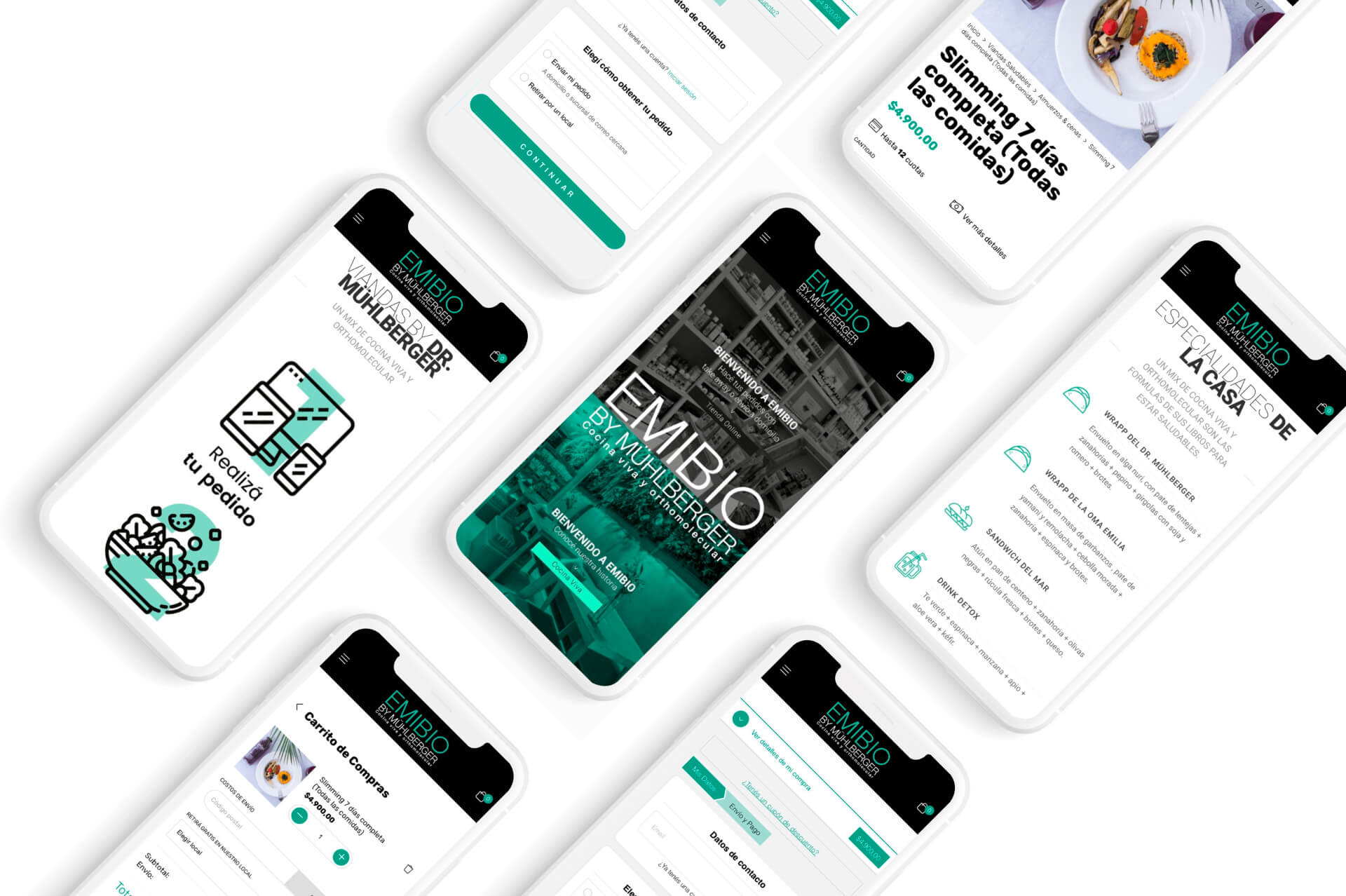
eCommerce
With enhanced visuals and an optimized user experience on both mobile and desktop devices, the Emibio by Mühlberger website was designed entirely to facilitate the shopping experience. Its architecture was reviewed to allow easier access to different levels of information and was complemented with the iconography developed by the agency.
The "why"
Discovering the brand's story was the first challenge we faced: a story that reflects orthomolecular practices and food, to find all foods free of contaminants, gluten, lactose, caffeine, and toxic components of industrial food manipulation.
Inspired by Emilia (Doctor RM's grandmother) and her natural dishes, we used three pillars that served as a basis for the concept: mind, body, and soul in harmony.
The "how"
After the initial research stage and working on this compelling brand story, we moved on to defining the brand identity and its visual universe; inhabited by relaxing landscapes and a palette of serene colors.