Case study
Klinik Mühlberger
The clinic of the future + the design of the future.


Category - Branding - Packaging
Client - Dr. Mühlberger
Year - 2019
Country - Argentina
What we did
-
1
iPad App
We developed an app so that patients can learn about the treatment they want to undergo or any of the many treatments the clinic offers. This helps them enter the consultation more informed and confident.
-
2
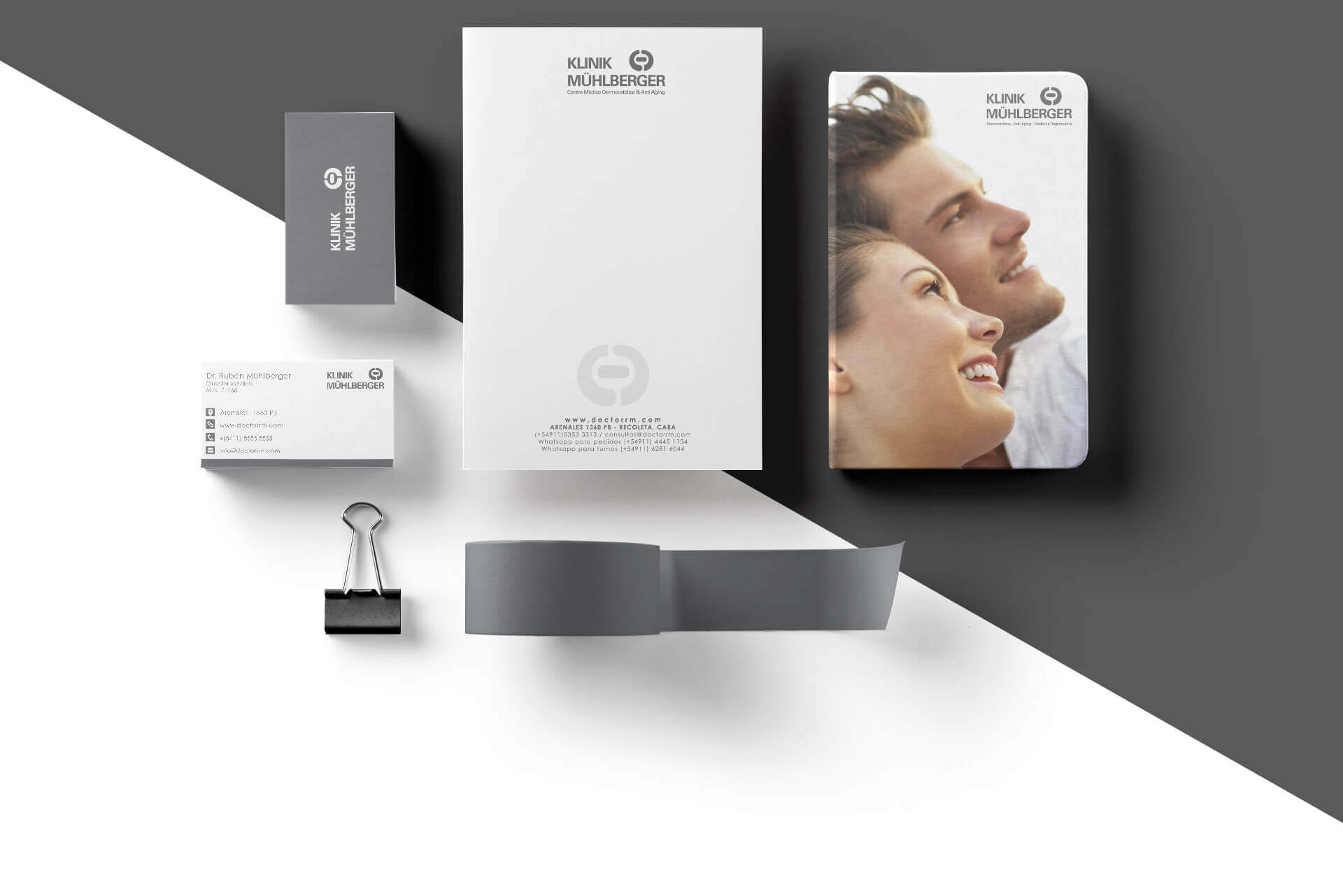
Applications
White and gray are prominent in the brand's visual universe, applied to brochures, stationery, product packaging, signage, menus, and exteriors. White space is used extensively to convey a sense of calm. Simplicity is key to a meaningful life.
-
3
Digital Totem
The waiting time before the consultation was improved not only with iPads, but also with a digital totem on which patients can see the recommended treatment according to the pathology they choose.
The "why"
When Klinik Mühlberger was conceived, the most sophisticated and exclusive centers in the world were considered, but also the philosophy of Buddha, a style that seeks harmony through natural materials, aromas, and simplicity. That idea is conveyed in all communication layers that are made.
The "how"
As stimulating as it was, our greatest challenge with Klinik Mühlberger was to translate the solid concept behind the brand into a meaningful user experience on their websites, while aligning with the excellent experience they offer at the clinic. We chose to create the website interface in black and white, leaving color elements to show only details.